Good Design
The majority of the typical users of this website can be split up into two groups, students and prospective students. The first set is prospective students and possible majors, and the page welcomes them nicely. The design is simple, using mostly essentials to display the relevant information. The search and menu bars in the top right are distinct enough to find, but aren’t too obvious as to detract from the rest of the page.
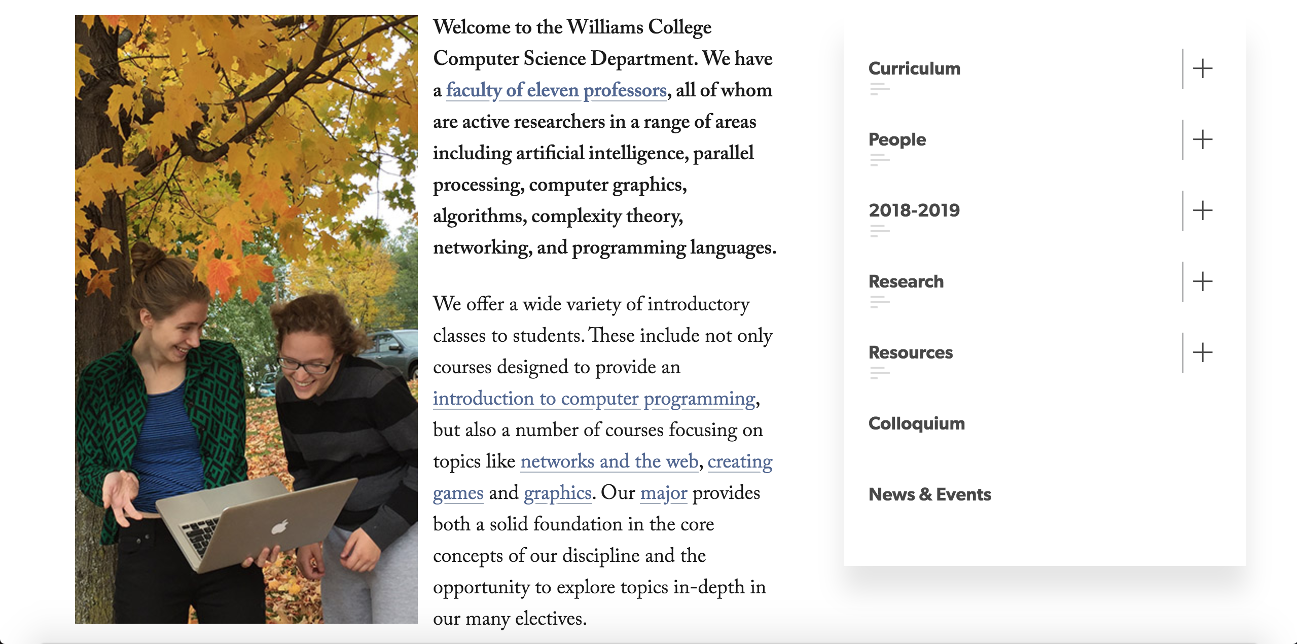
Additionally, the font of the right panel menu and the main text are simple and easy to read. Although, one of the most significant subtleties is probably the picture. It shows two computer science majors outside with the beautiful fall leaves, holding a computer, and having fun. This could possibly encourage prospective students who think computer scientists just sit in a comp sci lab all day long. Additionally, the two people in the picture are women, going against the stereotype that computer science is a completely male dominated field.
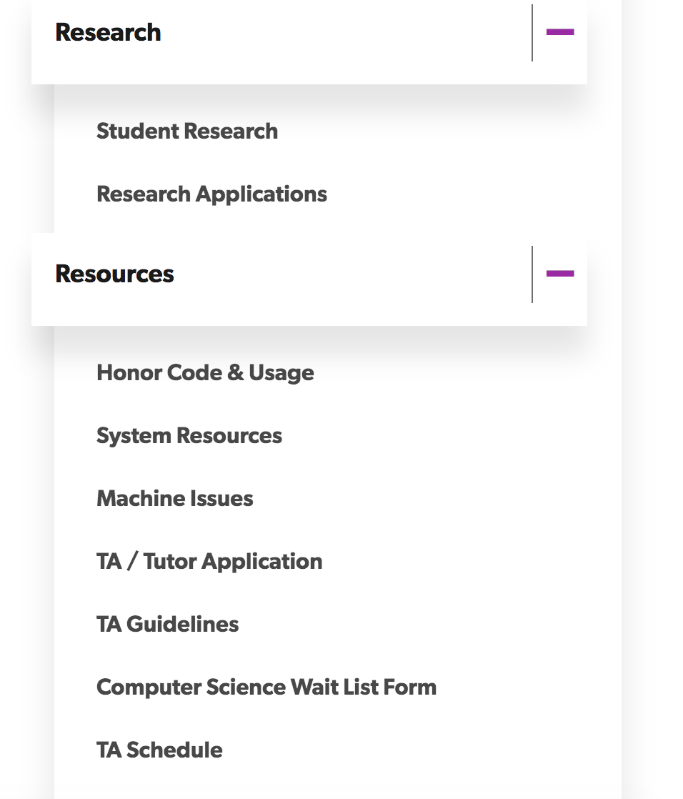
The other primary set is the group of current cs majors. Even though a lot of the above applies to this group, these people will probably be looking for different information than prospective students. Some of these things may include learning how to apply for summer research, or maybe just the schedule for this year’s colloquia. However, the panel on the right side of the website makes all of this information easily accessible, and even when you navigate off of the main cs page, there’s always a tree showing you how to get back to one of the pages you were on before.
Overall, the cs webpage makes the user feel good for using it, as it has all of the information right where you think it should be. It also has a responsive design which automatically resizes and hides features on a page to make it look good on all devices, regardless of the size of the screen. All of these things come together to make a very fluid experience.