Bad Design
In addition to being a cs major, I am also an Econ major. But, unfortunately, the design of the Economics website appears to be much worse than the cs one. Similarly to the reflection for the cs webpage, we have to see this page through of the lens of two primary groups of people, prospective students and current majors. However, for both groups, the first clear problem is there is just too much clutter.
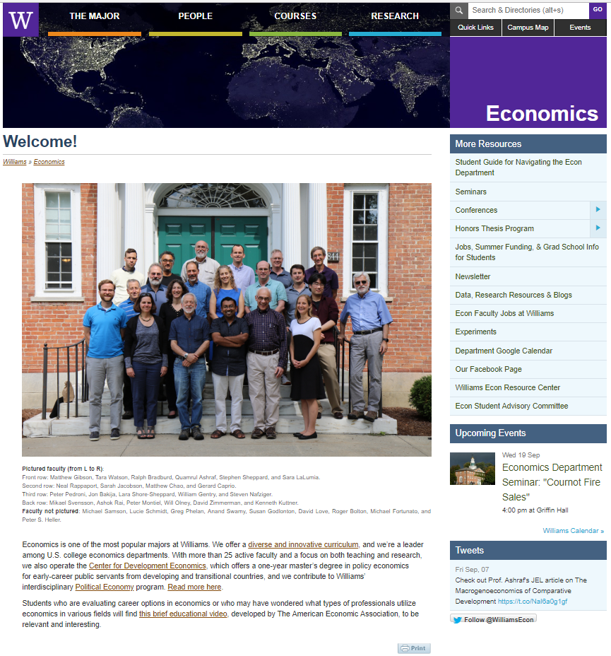
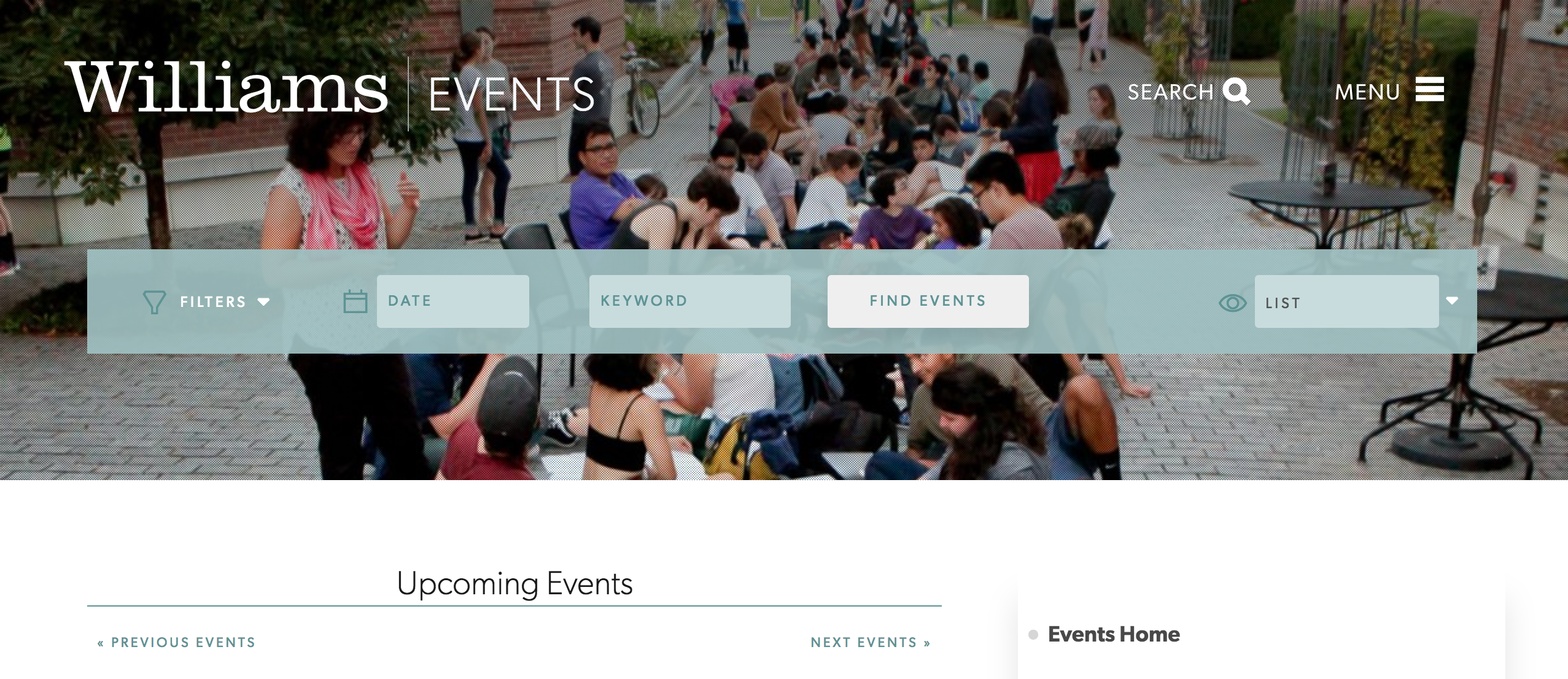
Even though the menu in the top right is trying to give some resources for people who visit the page, it doesn’t look very professional, and it probably shouldn’t even be a part of the webpage. The Events tab doesn’t even link to specifically Economics events. Instead, it leads to school wide events, which makes us question why it’s in the Economics major front page.
Another problem with the page has to do with the pictures. The tabs at the top of the page are nice because they have simple text and even a colorful marker to distinguish between the tabs. However, these tabs block the picture of the world in the background which I find visually displeasing. Additionally, even though the picture of the faculty is nice, this may be more intimidating to prospective students. I think the cs website using a picture of students instead of faculty is much more welcoming to other students looking at the webpage.
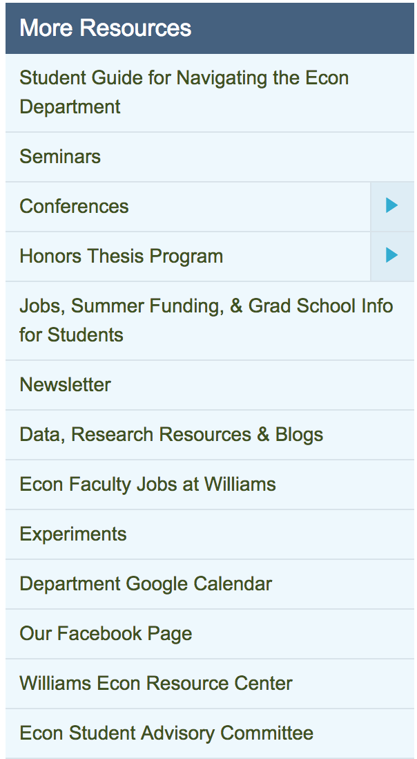
Finally, the typography of the Economics page is not a visually pleasing as it could be. Especially in contrast to the cs website, the right panel looks much less organized. The spacing between each item is much smaller than it was for cs, and the text font is different. This just makes it feel more overall cluttered. Additionally, I feel like the blue background of that resources panel doesn’t fit well with the purple and dark blue colors above.